I converted my microblog to be my primary home page.
First, I converted my microblog to the Alpine theme. I love the aesthetics of the Tufte theme (GitHub) I was using by @pimoore, but it hasn’t been updated in a while and Micro.blog has been adding features rapidly.
I briefly flirted with @mtt’s Tiny Theme for its flexibility, but I like the out-of-the-box behavior of Alpine better.
But if it was going to be my home page, I wanted it to be a little richer. @manton’s home page is quite stark, which is probably what he wants: it drastically centers the microblog.
But I wanted more.
So I dug into the theme and made a few changes: I added a second column for photos posts (based on a category)1, which meant I had to add a little more space. By default, the column of posts is only 700px wide; mine is 55em wide.
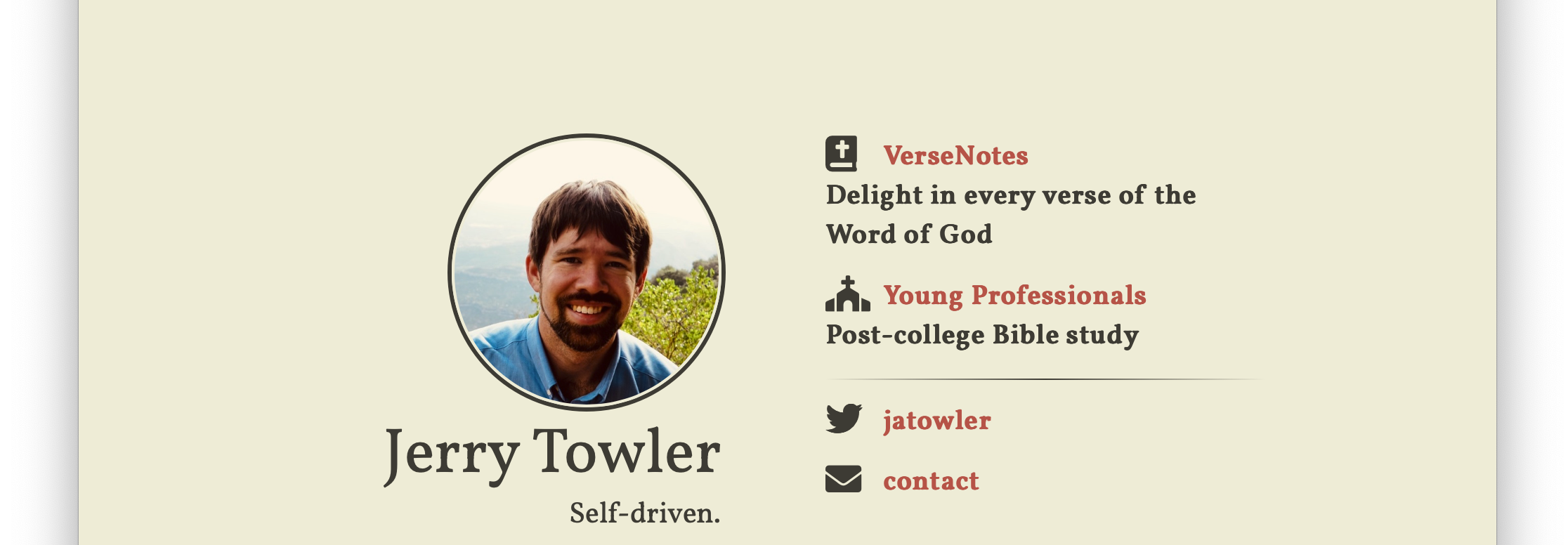
The attached picture is my previous home page, made using Jekyll’s Compass theme, for posterity.
Two down.

-
Of course, I’m now loading two copies of every photo post because I haven’t yet figured out how to exclude them from the main list. ↩︎